The Tick of Disapproval - What a tick in user testing taught me about internationalisation
A simple tick icon seems like a universal way to communicate success, but is it?
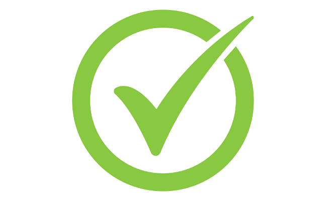

One of my favourite things about user testing is that participants keep finding new ways to prove that I don't know everything.
This week's lesson came in the form of a tick.
Not the ‘check your legs after a hike’ kind.
This one ✓
Our participant had completed a task successfully and the interface showed a tick to confirm it. Pretty standard.
Except there wasn't sufficient text explaining what the tick meant.
As we were talking through the screen, the participant casually said:
"In some cultures, a tick means the opposite."
I was immediately intrigued.
To me, and I’m sure many others, a tick means success.
Need to show a task is done? Add a tick.
Need to indicate a correct answer? Add a tick.
Need to reassure users they've completed a process? Add a tick.
Success!
As it turns out, that’s not always the case.
The comment stuck with me after the session ended. So, I did what all good researchers and curious bunnies do when they encounter something unexpected: I started digging.
What began as a quick search turned into a rabbit hole.
One article led to another. Examples from different countries. Discussions about symbols led to discussions about localisation. Localisation led to internationalisation. Before long, I found myself reading the W3C's internationalisation resources and realising just how much I had taken for granted.
The W3C highlights that symbols are not universally interpreted. Different cultures assign different meanings to visual cues that many designers assume are self-explanatory. In Japan and Korea, for example, a circle (○) is commonly used to indicate correctness. The opposite is X (×), which means incorrect, wrong, or not approved. This is so common that true/false quizzes in Korea are often called "OX quizzes"
So, a Korean user might naturally interpret:
- ○ = Correct / Yes / Success
- × = Incorrect / No / Failure
- △ = Partially correct / So-so / Incomplete (sometimes used in education)
And suddenly the humble ✓ doesn’t feel quite so universal.
My lesson in this?
The participant hadn't uncovered a problem with a tick. They had uncovered an assumption I didn't know I was making.
The original problem wasn't really the tick.
The problem was that the tick was doing all the work.
There wasn't sufficient text accompanying the icon. The design relied on users interpreting a symbol correctly and assumed that everyone would bring the same understanding to it.
Which is apparently a risky assumption.
In Accessibility, we spend a lot of time reminding teams not to rely on colour alone to communicate meaning. A success message shouldn't just be green. An error shouldn't just be red. Information should be reinforced through text, labels, and context.
This experience reminded me that the same principle applies to symbols.
A tick might seem obvious.
Until someone (rightfully) challenged that assumption.
When people hear the term internationalisation, they often think about translation. Converting content from one language to another. Supporting different character sets. Adapting content for different regions.
But internationalisation is much broader than language. It's about recognising that users bring different cultural expectations and interpretations to the experiences we design. Something that feels completely natural in one country may be confusing, misleading, or even mean the opposite somewhere else.
The more I read, the more I realised that accessibility and internationalisation have a lot in common.
Both challenge assumptions.
Both force us to confront the idea that our own experience isn't universal.
Both remind us that "obvious" is often only obvious to people who think like we do.
The biggest lesson wasn't that a tick can mean different things.
It was that I’d never thought to question it.
The tick felt so self-evident that it had become invisible.
And that's often where the most valuable usability insights live. Not in the things we know are complicated, but in the things we've stopped noticing because they seem so familiar.
One participant made an offhand comment during a usability session.
A few hours later, I'd disappeared down an internationalisation rabbit hole and emerged with a completely different understanding of one of the most common symbols in digital design.
It's also a reminder of why testing with real users matters so much.
Not users who look like us.
Not users who think like us.
Not users who work in our industry.
Real users.
People from different cultures. People with disability. People with different levels of education and digital confidence. People from different socioeconomic backgrounds. People who speak different languages, use different devices, and bring different life experiences to every interaction.
Because the assumptions we don't know we're making are often the assumptions most likely to exclude someone.
No accessibility guideline, design system, heuristic review, or expert evaluation would have taught me this lesson as effectively as a single participant sharing their perspective.
That's the real value of user testing. It doesn't just validate designs. It reveals assumptions we didn’t know we were making.
And sometimes those assumptions show up in the smallest places – like a tick.
If you want to understand how diverse users experience your products and services, we can help.
At TTC, we test with people from a wide range of backgrounds, abilities, experiences, and communities, helping teams surface the assumptions built into their designs.
Because the people who use your product will always notice something you didn’t.